

.png)

BEAUTY WITH A
HIGHER STANDARD
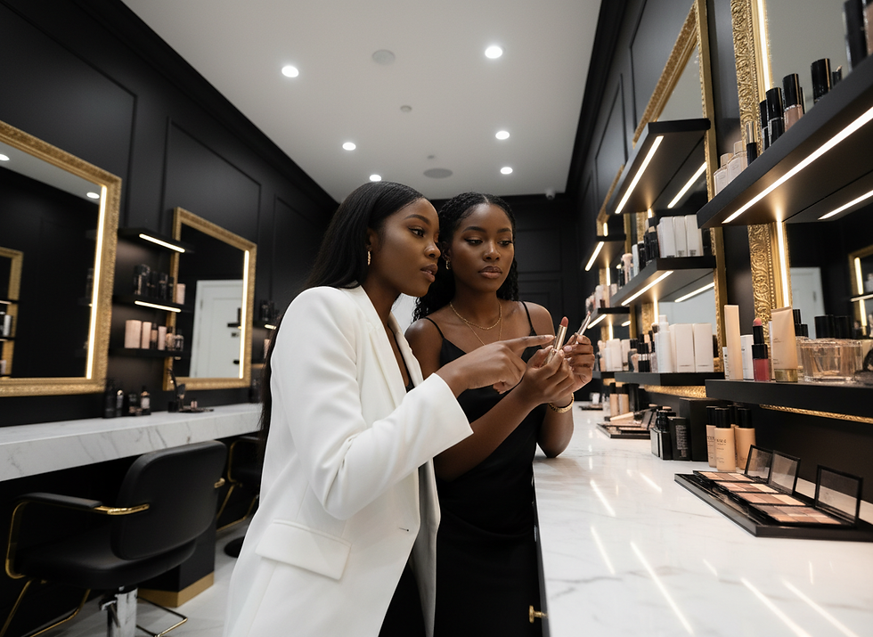
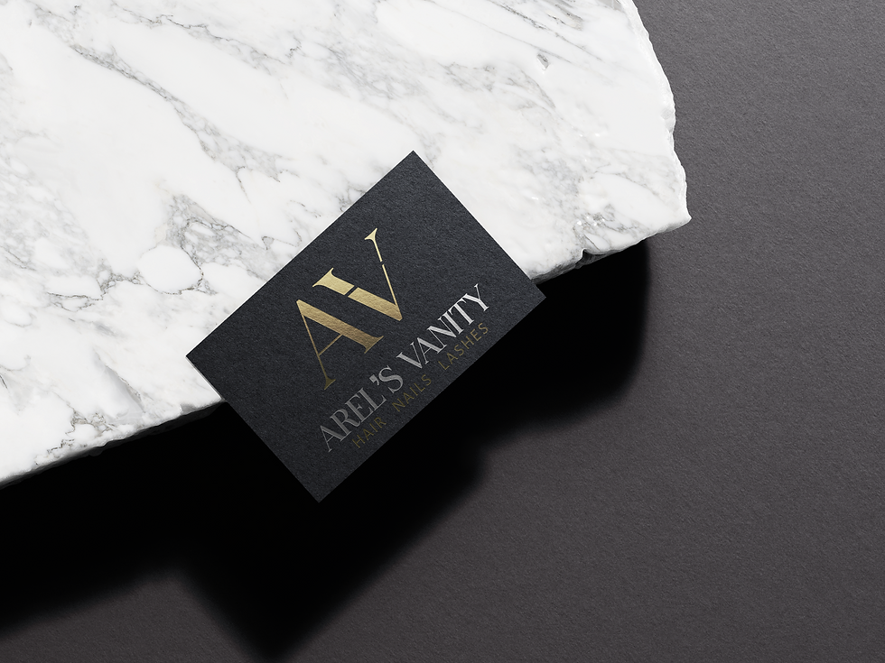
We created a clean logo, a luxury color palette, and visuals like mockups, lifestyle images, and a poster to show how the brand can be used.
Arel’s Vanity started with an idea, but had no brand look yet. The client knew what she wanted to build, but needed help showing it to others. There were already many salons in her local city. Our client was afraid she would blend in and be forgotten with the local competition. The goal was to create something that stood out and felt different.
Challenge
We decided to go the luxury route to help Arel’s Vanity stand out against her local competition. Instead of using bright and playful colors, we went with a more clean and elegant look. We picked dark colors with white contrast to give it a bold and polished feel. Instead of yellow, we used gold to make the brand feel more rich and premium. Every choice was made to make the brand feel more special, while still being welcoming.
Solution


THE PLAN
The goal was to make Arel’s Vanity look more valuable than other salons in the area. The branding was made to work across products, marketing, and future growth. This allows the brand to grow into more locations and even sell products later on.


See More Work

Baked goods with a secret audience
Wake & Bakery

A healthy alternative caffeine for athletes
Hi-T

An all inclusive spiritual escape
Woodside Manor
SERVICES
-
Logo
-
Logo Variations
-
Fonts/Type
-
Color Palette
-
Style Sheet
-
Ad/Poster
-
Lifestyle Image
Challenge
Arel’s Vanity started with an idea, but had no brand look yet. The client knew what she wanted to build, but needed help showing it to others.
There were already many salons in her local city. Our client was afraid she would blend in and be forgotten with the local competition.
The goal was to create something that stood out and felt different.
Solution
We decided to go the luxury route to help Arel’s Vanity stand out against her local competition. Instead of using bright and playful colors, we went with a more clean and elegant look. We picked dark colors with white contrast to give it a bold and polished feel. Instead of yellow, we used gold to make the brand feel more rich and premium.
Every choice was made to make the brand feel more special, while still being welcoming.